 Ideas for a smarter digital life.
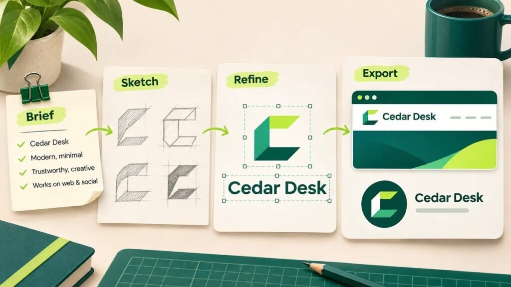
To design a logo, define your brand and audience, sketch a few simple concepts, choose readable typography and colors, then test the design at different sizes. Finish by saving editable artwork and exporting the versions you need for your website, social profiles and print materials.
You can begin with a free logo maker, an AI generator or a design editor. The important part is checking the result: a logo should identify your business clearly, remain readable when small and work outside the tool where you created it.
This guide follows a fictional business, Cedar Desk, from a short brief to a practical logo file set. The examples are original teaching exercises, not results from a comparative product test.
1. Write a short logo design brief
Before choosing an icon, write down what the logo needs to do. A useful brief answers five questions:
- What is the exact business name?
- Who is the audience?
- Which three qualities should the design communicate?
- Where will the logo appear?
- Which styles or associations should it avoid?
For Cedar Desk, the brief is: “A workspace-planning business for people setting up small home offices. The identity should feel clear, practical and welcoming. It must work in a website header, a circular social profile and a printed checklist. Avoid a corporate office-tower symbol or tiny furniture illustrations.”
This brief gives you something to assess. A detailed desk illustration might look attractive, but it fails if its lines disappear in the profile image.
If the logo is part of a website project, decide how it will fit the navigation and header before finalizing it. ThinkQuarry’s Web Development service page explains how website structure and visual decisions fit into a wider build.
2. Research your category without copying a competitor
Look at several businesses serving a similar audience. Record patterns rather than collecting designs to imitate: repeated colors, common symbols, type styles and layouts.
Then ask where your own identity could be clearer or more distinctive. If every workspace business uses a chair icon, you might explore typography or an abstract arrangement instead.
Keep inspiration separate from source artwork. Do not trace another company’s mark or change a few colors and call it original. A visual similarity search can help identify obvious lookalikes, but it does not establish that a design is legally clear to use.
3. Choose a logo type that fits the name
A logo does not have to illustrate everything the business does. Choose a structure that makes identification easy.
| Logo type | What it contains | Useful when | Main check |
|---|---|---|---|
| Wordmark | The business name in distinctive typography | The name is reasonably short | Is it readable in the header? |
| Lettermark | Initials | The full name is long | Will people understand the initials? |
| Symbol | An icon or abstract mark | A compact identifier is needed | Can people recognize it without the name? |
| Combination mark | A name and symbol | You need full and compact versions | Do both parts work together and separately? |
Cedar Desk starts with a wordmark and a simple corner-shaped symbol suggesting an organized workspace. It does not need a desk, chair, lamp and plant inside one badge.
For a new business, showing the name alongside the symbol can help people connect the two. Keep the symbol usable on its own for small spaces, without assuming it will immediately be recognized.
4. Sketch several directions before opening a generator
Draw a few rough ideas on paper or in a basic drawing app. The goal is to explore structure, not produce polished artwork.
Try the name alone, initials, and one name-plus-symbol arrangement. Use black first so gradients and textures do not distract from weak shapes.
For Cedar Desk, compare these directions:
| Concept | Problem found | Decision |
|---|---|---|
| Detailed desk inside a circular badge | Too many small parts | Reject |
| Decorative script wordmark | Some letters are hard to distinguish | Reject |
| Clear wordmark with one corner symbol | Name remains readable; compact symbol is possible | Refine |
Select a direction because it fits the brief. You do not need to combine every attractive idea into the final logo.
5. Choose a free logo maker or design editor carefully
A free logo creator can speed up layout exploration. An editor gives more direct control over shapes, letter spacing and alignment. An automatic logo design tool can suggest starting points, but you still need to make the final choices.
Before spending time customizing, check what “free” includes:
- Can you download the finished logo, or only preview it?
- Which file formats are included?
- Is a transparent background available?
- Does the download contain a watermark?
- Is an account required?
- Can you return and edit the design?
- What terms apply to the fonts, icons and templates?
For example, Namecheap’s official Logo Maker page states that downloads include PNG and SVG files and that signing in is required to download or share a logo. Free use does not necessarily mean no account is needed. [1]
An SVG download is useful, but check that it contains the kind of editable vector artwork you need. A raster image placed inside an SVG container does not become an editable vector drawing.
Treat this as a selection checklist rather than a ranking of tools. Features and export restrictions change, so confirm the current download options before choosing a platform.
6. Use an AI logo generator for concepts, then inspect the artwork
If you are looking for a free AI logo generator, begin with a clear brief and check its generation and download limits separately. A free trial, free preview and free downloadable logo are different offers.
Here is an original prompt for the Cedar Desk exercise:
Create three separate logo concepts for “Cedar Desk,” a workspace-planning business for small home offices. Use a readable wordmark with one simple geometric symbol suggesting organization. Start in black on white. Avoid tiny details, desk illustrations, gradients, mockups and taglines. Keep the spelling exactly “Cedar Desk.”
Evaluate the concepts against the brief. Inspect the exact spelling, repeated letters, odd joins, uneven shapes and small details. If the generated lettering is wrong, rebuild the name as editable text rather than repeatedly accepting almost-correct results.
Keep the distinction between a concept and a finished identity clear. A generated image may need to be redrawn or rebuilt in a vector editor. Do not assume an AI output is unique, comes with exclusive rights or is ready for every commercial use. Review the provider’s terms and the assets involved.
7. Refine typography, spacing and color
Choose fonts for readability
There is no single best font for logo design. Compare a few options using the actual business name. Check whether similar characters are distinguishable and whether the style suits the audience.
Start with one typeface. Adjust spacing carefully: letters should feel connected without touching unintentionally. Check the gap between the symbol and name, too.
For Cedar Desk, a straightforward wordmark is easier to read than a narrow script. The visual interest comes from the corner symbol and balanced spacing, rather than several competing typefaces.
Choose colors for real backgrounds
Begin with a restrained palette. For the exercise, use deep green for the primary mark and a pale neutral background. Record the exact color values after choosing them.
Judge color in context instead of relying on universal claims such as “green always creates trust.” Ask whether the name remains visible, the palette fits the identity and the logo works alongside the website’s other elements.
Also prepare a single-color version. If the symbol becomes confusing without its gradient, improve the shape before adding effects back in.
8. Test the logo where people will see it
A large preview can hide practical problems. Adobe’s guidance recommends checking size, backgrounds, monochrome use and realistic placements before finalizing a logo. [2]
Use this review sheet:
| Test | What to do | What a failure suggests |
|---|---|---|
| Website header | Place it at the intended display width | Small text or poor proportions |
| Social profile | Preview it inside a circular crop | Important details sit too near the edges |
| Small icon | Inspect a compact version at small pixel sizes | The symbol needs simplification |
| One color | Render it in solid black | The design depends too much on effects |
| Dark background | Try an appropriate light/reversed version | Contrast or edges need attention |
| Print a sample at its intended size | Fine lines or text may not reproduce well |
For Cedar Desk, remove the tagline from the compact version and use the corner symbol for the smallest applications. Keep the full name in the primary website logo.
Ask a few people unfamiliar with the design to read the name and describe what they notice. Specific questions are more useful than “Do you like it?” Figma also recommends feedback and refinement before preparing final files. [3]
9. Export the right logo files
Keep an editable master before downloading delivery files. A useful file set includes a primary logo, compact icon, single-color version and a reversed version for suitable dark backgrounds.
| Format | Typical role | Important limitation |
|---|---|---|
| SVG | Scalable vector artwork for supported digital uses | Check that the artwork is genuinely vector and renders correctly |
| PNG | Transparent-background digital image | Enlarging a small export can look blurry |
| JPG | Image for situations that do not require transparency | Does not support a transparent background |
| Vector PDF | Print delivery when accepted by the printer | Confirm export and production requirements |
| Native source file | Future editing | Keep fonts/assets and their usage information organized |
Do not rename a JPG to PNG to create transparency. Export from the source with a transparent background and test it over a colored surface.
Use descriptive filenames such as cedar-desk-primary.svg, cedar-desk-primary-transparent.png and cedar-desk-icon.png. Keep a short usage note with colors, fonts, background options and minimum usable sizes based on your tests.
10. Check asset permissions before publishing
Using a tool successfully does not establish exclusive rights to everything inside the design.
Canva’s official guidance explains that shared logo templates and stock graphics have non-exclusive rights. Its guidance distinguishes those assets from original designs made with permitted fonts, basic lines and shapes, or original artwork you upload. [4]
Check the specific asset and product terms rather than assuming a paid subscription makes every element exclusive. If trademark registration matters to the business, seek appropriate professional advice for your intended market; a tool’s download screen is not a trademark clearance process.
Common logo design mistakes and practical fixes
| Problem | Practical fix |
|---|---|
| Too many symbols | Keep one concept and remove details that do not aid recognition |
| Name becomes unreadable when reduced | Simplify typography or use a better-fitting layout |
| White rectangle behind the logo | Export a transparent PNG or suitable SVG from the source |
| Blurry website logo | Use genuine vector artwork where supported, or a sufficiently sized raster export |
| Profile picture cuts off the design | Add safe space and test a circular crop |
| Design only works on white | Create and check alternate background versions |
| Free download is locked | Check export requirements before investing more editing time |
| AI misspells the name | Rebuild lettering as editable text and proofread it |
| Template looks too familiar | Develop original structure rather than merely recoloring a shared layout |
Frequently asked questions (FAQ)
Can I design a logo myself without experience?
Yes, you can start with a simple wordmark and a clear brief. Work through sketches, typography, testing and export rather than expecting the first generated option to be finished. Complex identities or specialized production requirements may benefit from a designer’s help.
How can I design a logo for free?
Use a free editor or logo maker whose current download options meet your needs. Check export formats, transparency, watermarks, account requirements and asset permissions before customizing.
Is a free AI logo generator enough for a business?
It can help explore concepts. The final design still needs accurate lettering, usable files, size testing and a review of applicable terms. A generated preview alone is not a complete business identity.
Should my logo include an icon?
Only if it improves identification or gives you a useful compact version. A readable wordmark can be sufficient. Avoid adding a symbol simply because the template has one.
Is SVG or PNG better for a logo?
They serve different purposes. Genuine vector SVG artwork scales well in supported environments. PNG is useful for transparent digital images, but its pixel dimensions limit enlargement. Keep both when available.
Why does my logo look blurry?
A common cause is displaying a raster export larger than its available resolution. Return to the editable source and export an appropriate size or use genuine vector artwork. Increasing the dimensions of an already blurry image will not restore missing detail.
Can I use one logo for my website and social profiles?
Use a consistent identity with different layouts. A horizontal wordmark may fit the website header, while a compact icon fits a circular profile. Test each version rather than forcing one layout everywhere.
Can I trademark a logo made from a template?
Do not assume so. Template and asset terms may provide non-exclusive rights. Review the provider’s guidance and get advice appropriate to your jurisdiction if registration or exclusivity is important.
How do I know when my logo is ready?
It should fit the brief, have correct lettering, remain usable at its intended sizes, work on required backgrounds and have appropriate export files. Keep the editable source and relevant asset information for future changes.
Final logo checklist
Before launch, confirm the exact name, test the real placements, prepare your primary and compact versions, check asset terms and save the master file. A simple logo that works consistently is more useful than a detailed preview that becomes unreadable when published.
For broader brand implementation, browse ThinkQuarry’s Technology and Web Guides.
Sources
Research checked 5 November 2026. Product information is based on provider documentation, not a hands-on comparative test.